The other day, Kate and I were talking with our friend Dana Densmore, owner of Green Lion Press, about the state of book printing these days. Dana said she hated print-on-demand books. Why? Because the quality is so poor! This went against what I had heard about the quality of POD printers such as CreateSpace. So we explored the topic a bit, and it turned out that the problem wasn’t just the quality of the printing and binding itself, but also problems with layout, typography, and other things that have more to do with the internal book design, art direction, layout, and pre-press preparation. Anyway, it was an interesting discussion. Dana’s been publishing for many years, and it’s been great talking about a topic where she has great expertise.
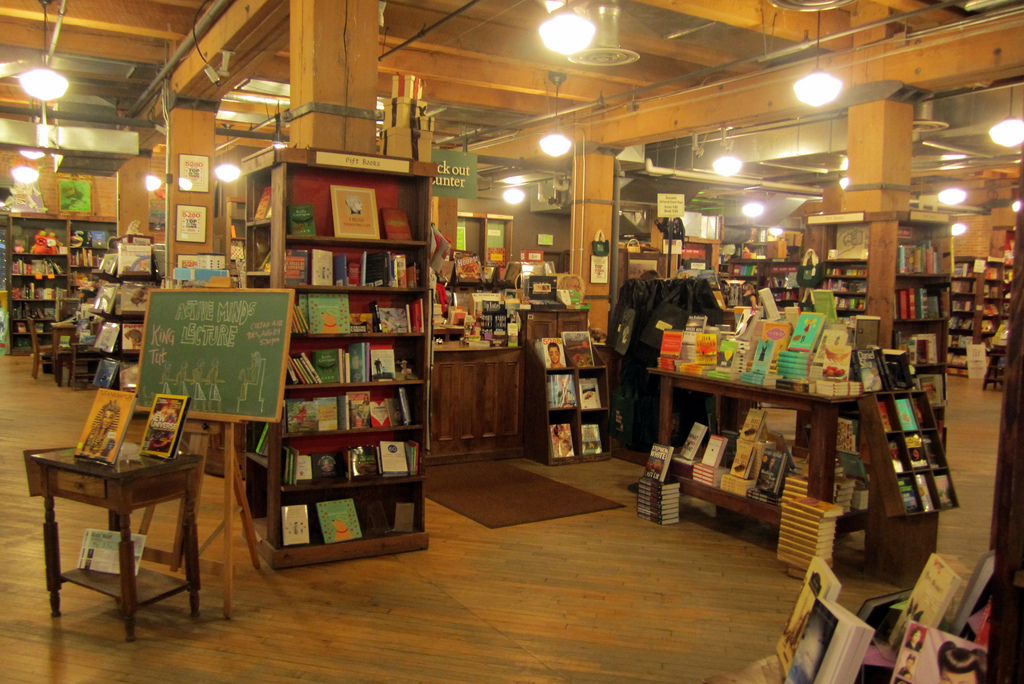
Fast-forward to yesterday: I was in a local indie bookstore (Tattered Cover) looking at a lot of books from independent presses, and one of the things that really leapt out at me was awkward—sometimes even bizarre—use of margins.
- Many books had pages with comfortable margins except for the fact that they had failed to account for the gutter, so the pages all felt off-balance, sometimes with words diving into the binding. Some books had imbalances in top and bottom margins, too, with huge margins up top and very thin margins down below—even books with bottom page numbering.
- A couple of publishers had made typeface choices that I could only feel were blunders. One had chosen an archaic font used in the 1800s with absolutely no leading—maybe trying to go for a retro feel, but in fact only achieving an unreadable page.
- One publisher seemed to have never looked inside a book before. The front matter was odd. For example, the copyright page was on the right-hand side (as opposed to on the back of the title page).
- One book had, in big print, a legalistic paragraph warning you that “if you sell or lend this book to anyone else, you are violating copyright law!” — a claim that, as far as I know, contradicts case law (and Supreme Court precedent), and pretty much soured any goodwill I may have been feeling towards that book. I put it back on the shelf, saying silently, “Okay, you can keep the book.”
Overall, the whole experience was thoroughly depressing. No wonder POD books have such terrible reputations!
I can’t say that I’m the typical book consumer, though. My background in magazine publishing probably has made me more attuned to these kinds of things—perhaps to a fault! And yet, even if most people don’t notice any of the things in particular, they will get a feeling of poorer quality, or even impaired usability.
In the indie book world, there’s great writing, there are fabulous covers, there are innovative new ways for authors to connect with readers…but it feels like when it comes to actual print book layout, there’s still a lot left to be desired.